

Products

.svg)

.svg)
Craft engaging designs to captivate your audience.

Ready to turn your creative ideas into products that actually sell? Print-on-demand (POD) makes it possible — but getting your design print-ready is the step that separates bestsellers from returns.
This POD design guideline covers every essential rule: resolution, sizing, bleed zones, color accuracy, copyright, and transparency effects. Follow these steps and you’ll deliver polished products your customers will love — and come back for.
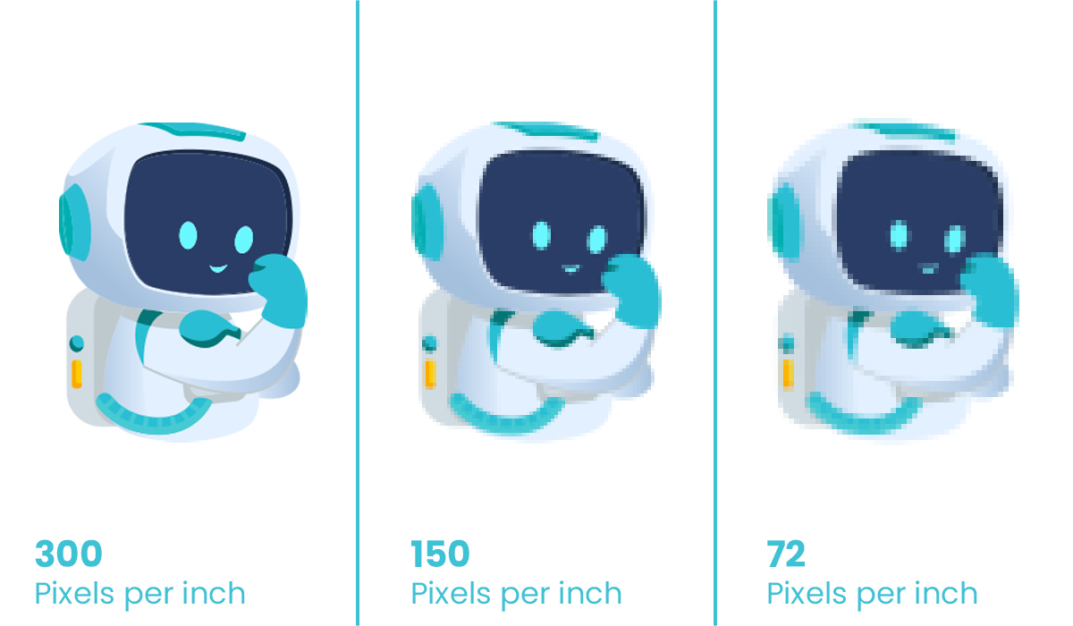
Poor image quality is the #1 reason POD products disappoint customers. When a low-resolution file gets stretched across a T-shirt or canvas, the result is a blurry, pixelated mess — and there’s no fixing it after printing.
The golden rule: always design at 300 DPI or higher at your product’s actual print dimensions.
DPI (dots per inch) determines how sharp your print looks. GearLaunch recommends 300 DPI for all products. See the full breakdown in our Print 101 guide.
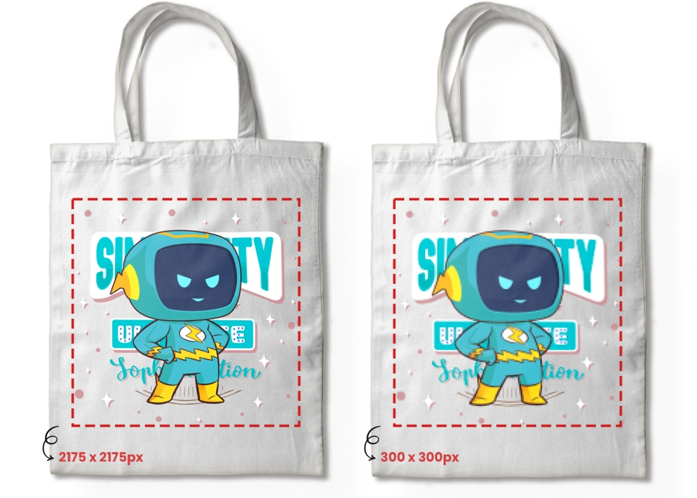
Always create or export your file at the final print dimensions of your chosen product. A design sized for a phone case will look pixelated blown up to a poster.
Raster images (JPG, PNG) degrade when enlarged. Vector graphics (SVG, AI, EPS) stay razor-sharp at any size. Use vector format for typography, logos, and line art. More on this in Design Tips – Artwork Requirements.
Pro tip: Not sure if your file is high enough resolution? GearLaunch’s product templates include the exact pixel dimensions needed. .
A perfectly sized phone case graphic will look tiny and lost on a tote bag. Always check dimensions before uploading.
Every GearLaunch product has a detailed size chart showing the exact printable area. Check them on the products page before finalizing any design.
GearLaunch provides free templates for all products showing the printable area, safe zone, and bleed zone. For example, Canvas templates are available on the Wrapped Canvas product page.
A sticker, a T-shirt, and a blanket each need different dimensions. Always resize before uploading to a new product type. See our guide on Designing Products for Print on Demand for product-specific tips.
Every POD product is trimmed during manufacturing. Without a bleed allowance, important design elements can get cut off.
The bleed zone is extra canvas space beyond the visible design area. When the product is trimmed to size, the cut lands inside this zone — ensuring your artwork fills edge-to-edge with no white borders.
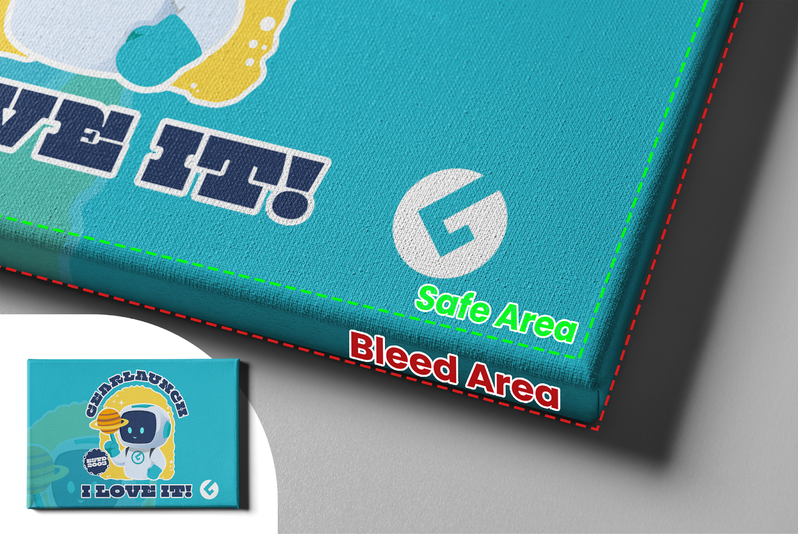
In Photoshop, Canva, or Illustrator, set up bleed zones and safe areas before you start. Keep all key elements — text, faces, logos — inside the safe area. Decorative backgrounds can extend into the bleed zone.
GearLaunch Wall Art products (Canvas, Framed Canvas) have a wrap zone where the design continues around the frame edges. Keep focal elements centered and make sure your background works when wrapped. See the full guide on Canvas Design and Blanket Design for product-specific bleed specs.
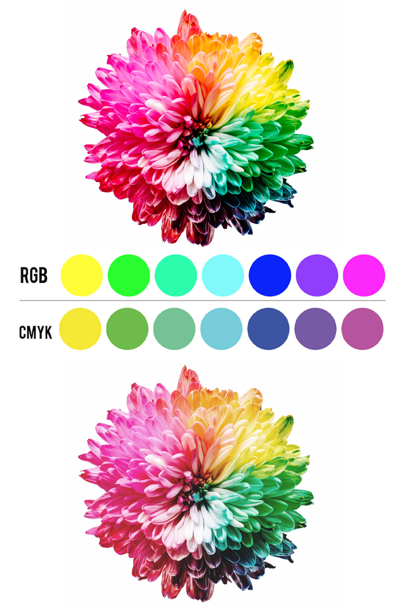
Colors on your monitor and on a printed product are not always the same. Printing method and monitor calibration both affect the final result.
DTG (Direct-to-Garment)
Dye-Sublimation
For a full breakdown of how each method affects your design, see Product Color Best Practices.
Always use the sRGB color profile when creating POD designs. It’s the industry standard for digital printing and gives you the most predictable output across products.
Calibrate your display to sRGB standards. An uncalibrated monitor can make you think your file looks great when it will print very differently.
Order a sample product before launching a campaign. This is the only way to verify real-world color output for a specific design and product combination.
Using copyrighted or trademarked material on POD products can get your store shut down or result in legal action. This applies to fonts, characters, logos, and phrases. Read our full Copyright and Trademark Guidelines for a complete overview.
Build your own original design library or work with licensed freelance designers. See our guides on How to Hire Freelance T-Shirt Designers and Where to Find a Designer.
Glow effects, smoke, gradients, and drop shadows look stunning on screen but don’t always translate well to print.
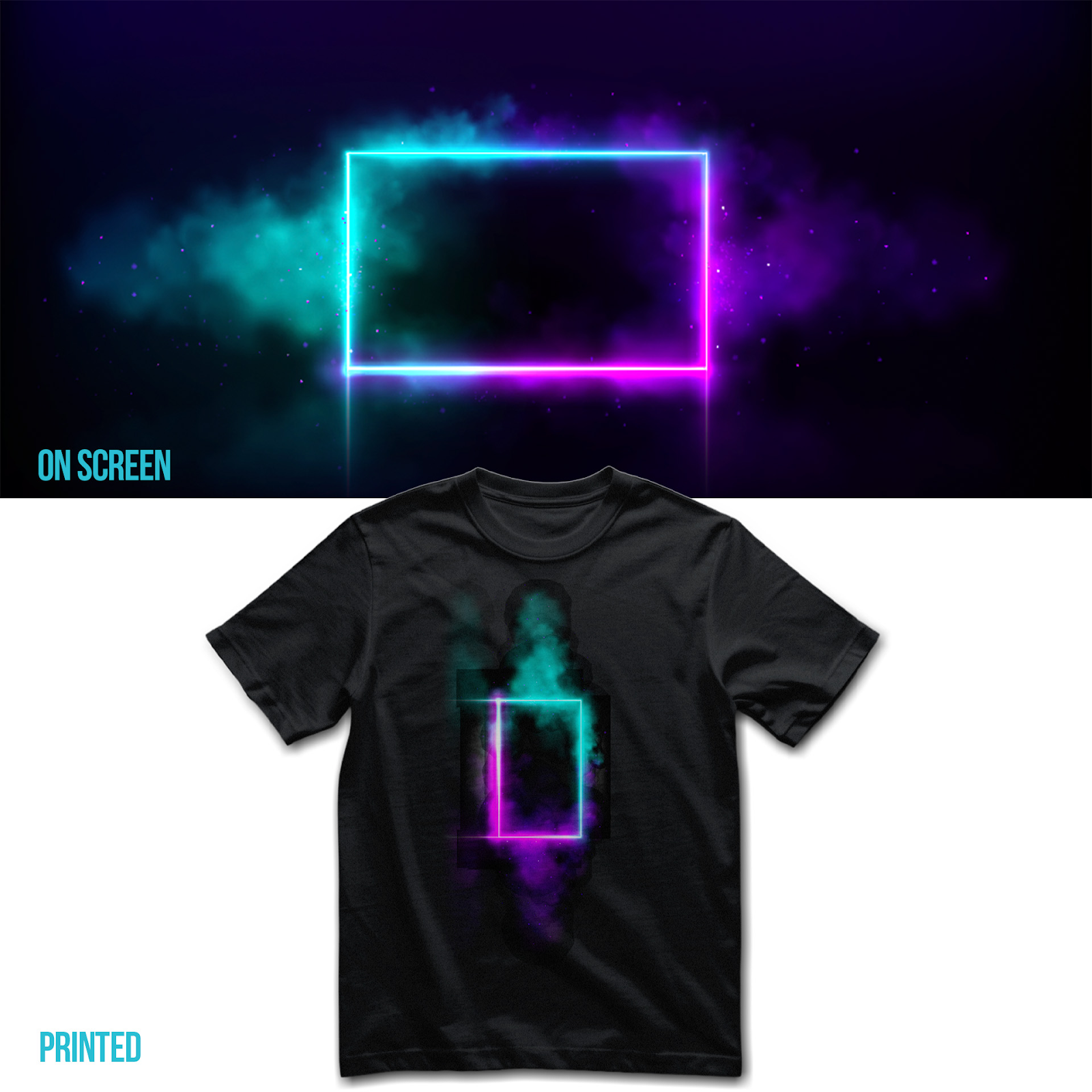
When opacity drops below 100%, the printer uses less ink in that area. On light garments this creates a faded, washed-out look. On dark garments, semi-transparent areas may show the fabric color instead of blending.
Hard-edged gradients
Glow, smoke, or haze effects
Full opacity flat design
For DTG apparel, designs with clean edges and 100% opacity produce the sharpest, most vibrant results. If you want to use transparency effects, test on dye-sub products first.
Once you’ve mastered the fundamentals, these resources will help you go further:
Great POD designs are built on the right technical foundation. Follow this POD design guideline to avoid the most common printing mistakes, stay copyright-safe, and create products that look as good in your customer’s hands as they do on your screen.
Ready to put these tips into action? Start your first campaign on GearLaunch today.


.svg)
.svg)
.svg)